Phases: a pole art collective
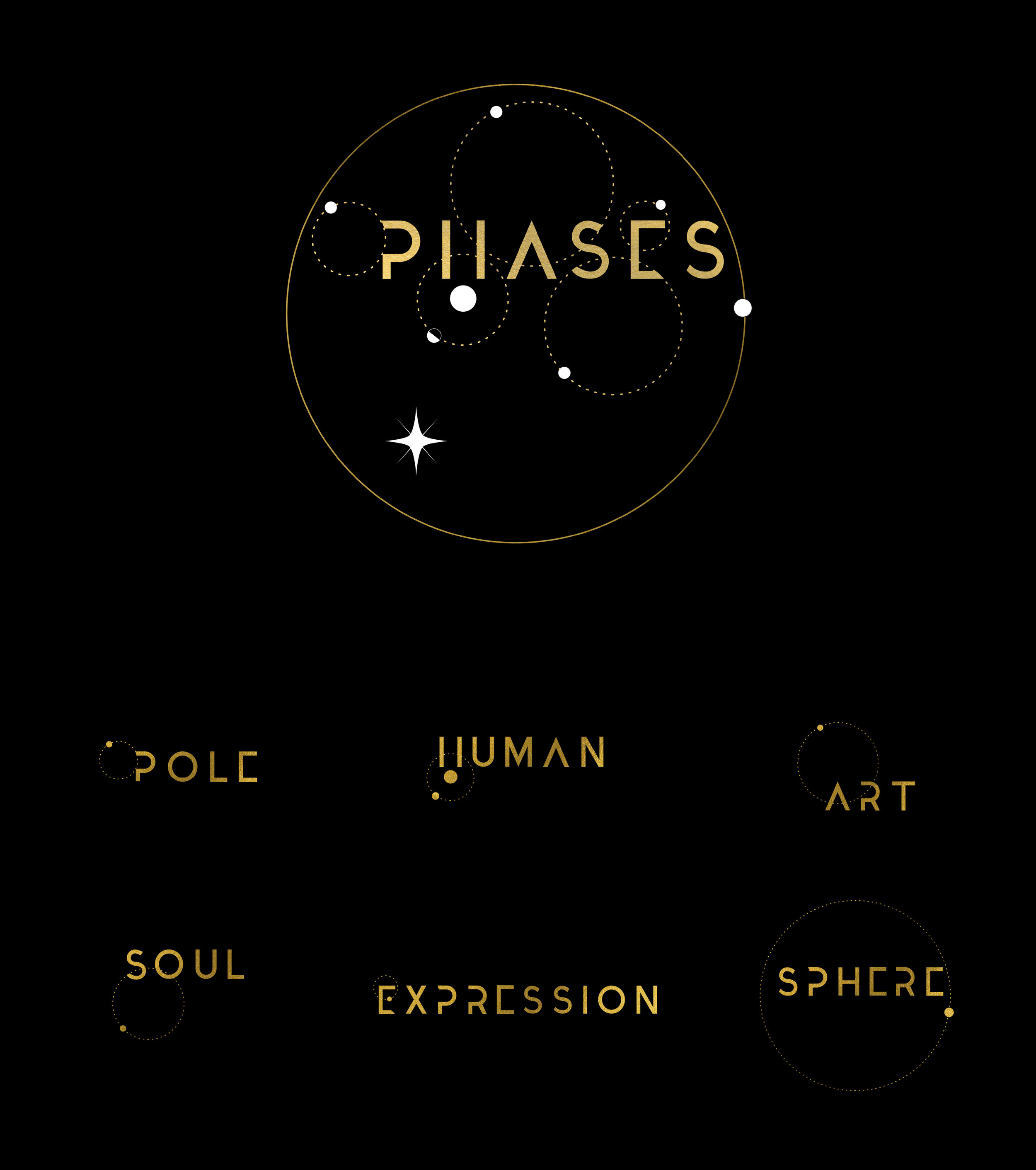
PHASES is a pole performance art collective in Portland, OR, created by Liz Epp and Laurel Carroll. The acronym summarizes the core tenets of their vision for a dance community and platform for artistic expression: Pole Human Art Soul Expression Sphere.
A Moonlit Odyssey
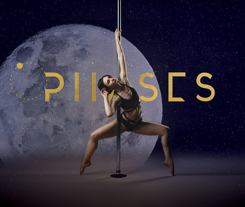
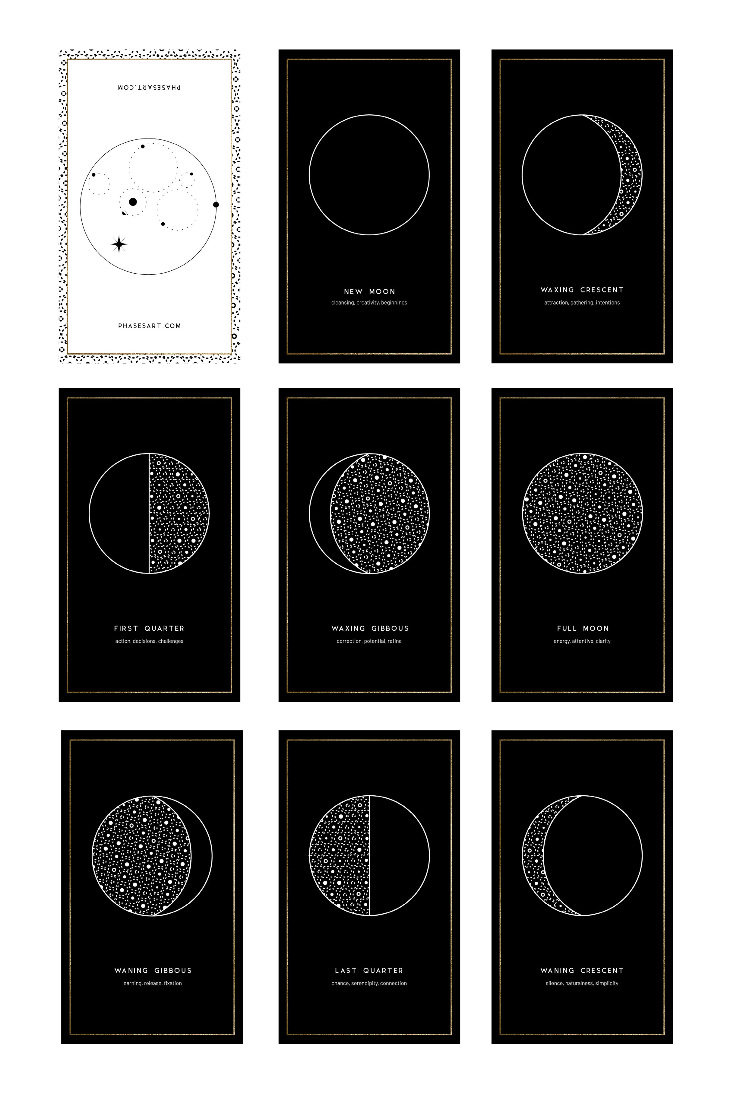
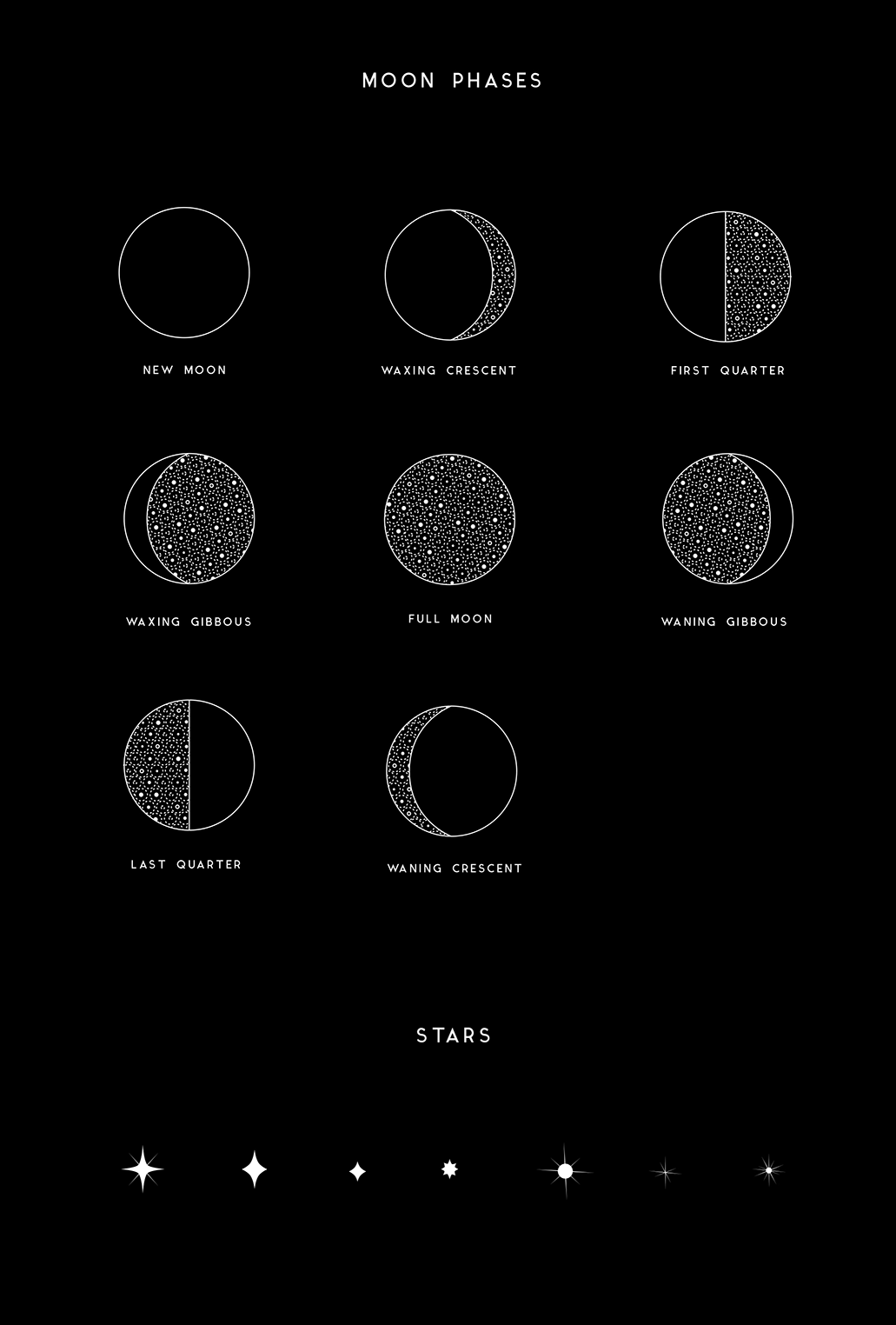
When the branding work for PHASES began, the co-creators knew the first show would be about the phases of the moon. As a concept the lunar cycle served as a format for the run-of-show, and provided enough room for interpretation for each dancer to create a piece that reflects what the varying stages of the moon mean to them.
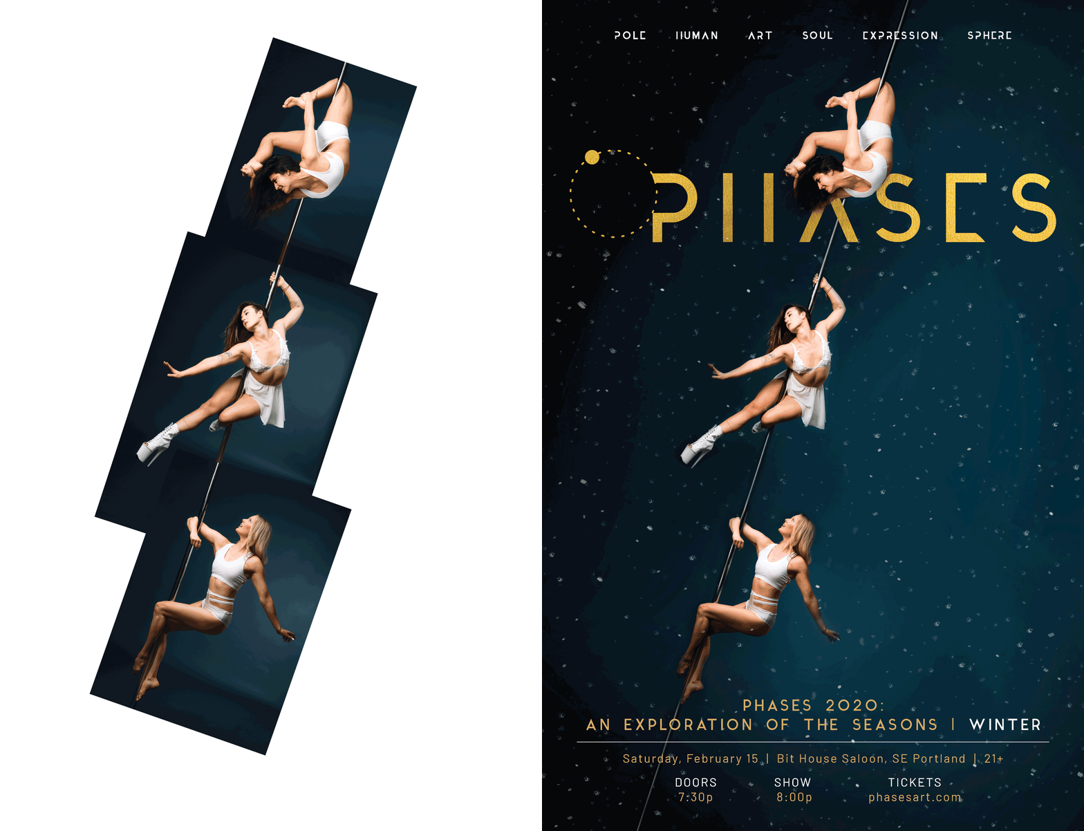
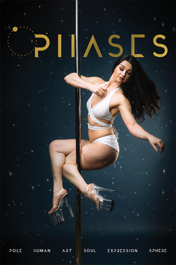
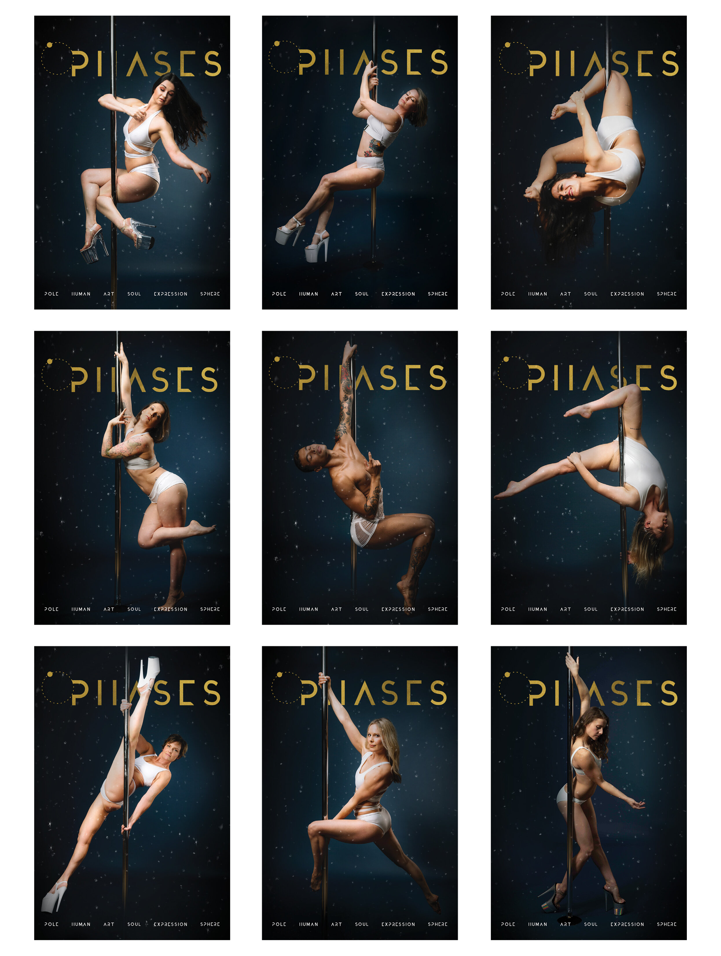
Designing promotional materials and poster art was a natural progression from the logo and branding. When it came to incorporating the images of the performers for key art, I wanted to create a surreal environment without overpowering the photography. The result was a composite that keeps the performer centered, in the foreground, using their silhouette to complete the word mark behind them.

PHASES 2020: Winter
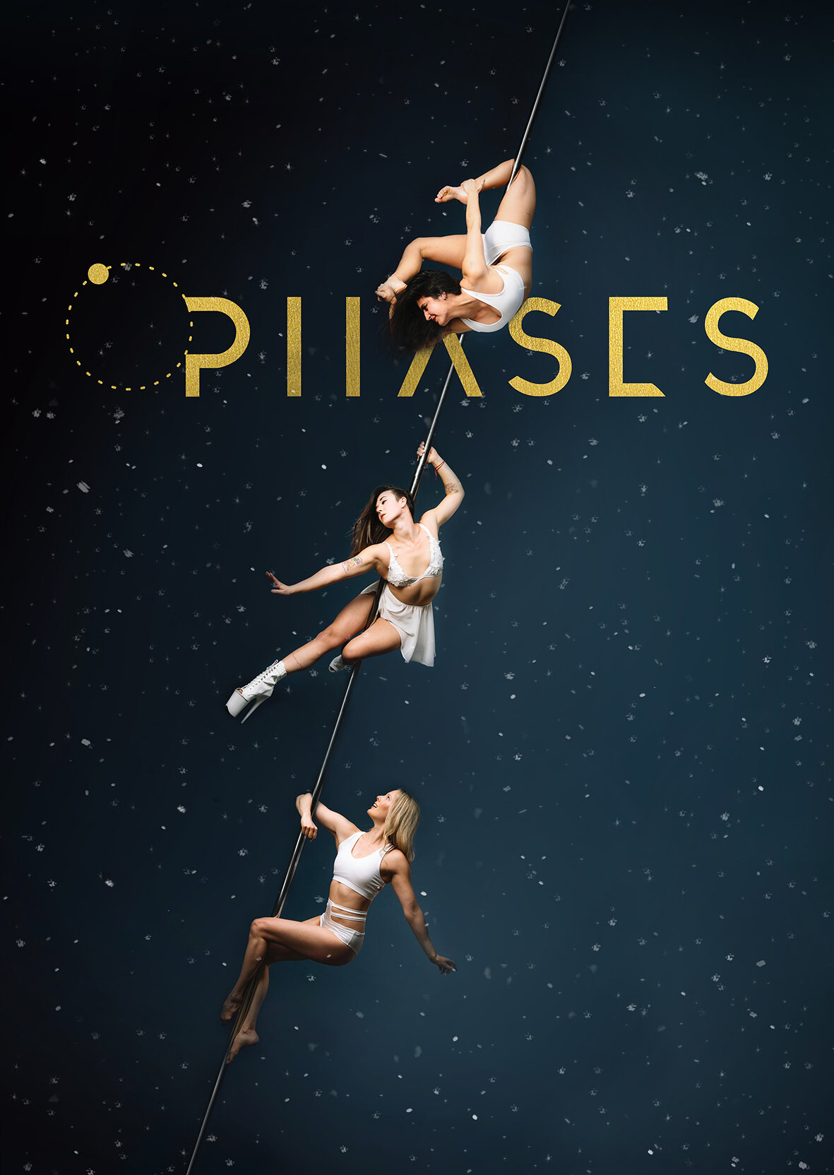
The winter show was the first of the lineup for PHASES 2O2O: An Exploration of the Seasons. Darkness and cooler elements were core concepts for the photoshoot, and snow became a naturally assumed part of the theme.
For the show poster, the stacking composite of the dancers on a single pole was inspired by a Diplo video that features some well-known pole artists. In my own interpretation, the dancers remind me of falling snowflakes.
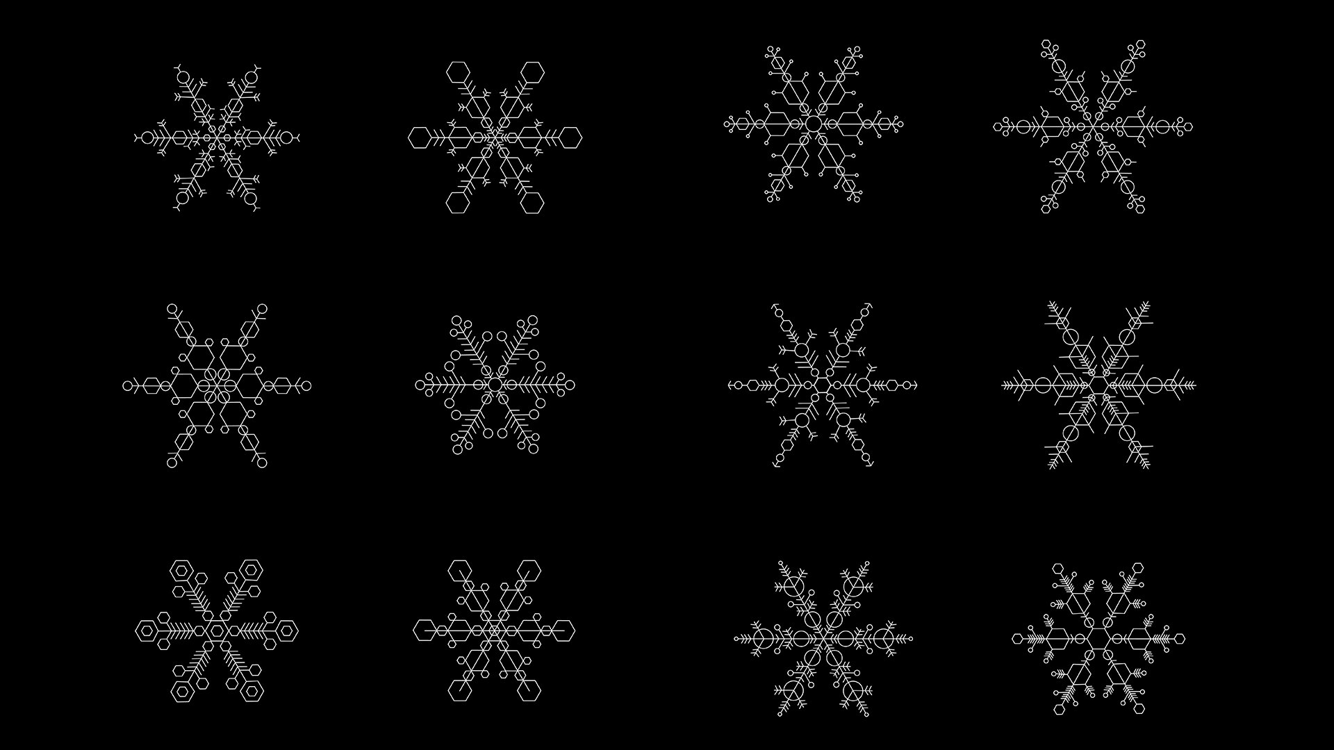
I continued the PHASES theme of creating illustrations for promotional materials by designing a unique snowflake for each dancer, and cards that featured each dancer individually. The show theme lent space for the dancers to craft pieces that embodied their memories, or experiences associated with the winter months. Ultimately the show resulted in a progressive story that ranged from celebration, introspection, darkness and hope.
PHASES 2020: Spring
The spring show for PHASES 2O2O was all about bringing some light and color as a breath of fresh air after the first two shows. The key art concept began with one of the co-creators approaching me with a rough drawing of staggered poles with cartoon flowers at the top, referencing the playfulness of Willy Wonka.
The idea of the Willy Wonka drawing got me thinking about the surreal themes that have carried these shows, and how I could incorporate florals in a way that were “real” but completely unnatural and whimsical. I wanted to source individual florals for each dancer, and apply inorganic textures and colors to give them a somewhat fabricated look. I took a lot of inspiration from iridescent plastic film as a material.
I began to scope out how we could extend this artwork into the promotional content for social media - with the hope that I could evolve the work to include motion. I experimented with background textures and displacement maps to make the static photography more dynamic and surreal.
Unfortunately, we halted creative during post production, and had to cancel the show due to the pandemic.


PHASES - Brand Design
In the initial discussions around branding PHASES, we emphasized the importance of creating something set apart from existing pole tropes. The vision was to have a collective that was inclusive of all types of pole dance styles and performers, and a brand ethos that gave dancers themes to interpret and populate with their own artistic license.
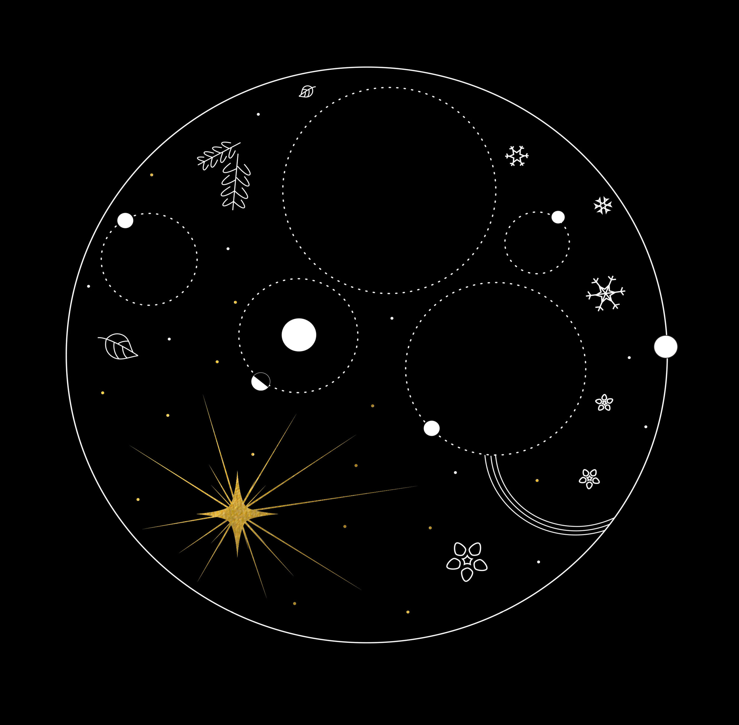
In itself, pole dance is an apparatus-based form of movement that employs circular physics as the core foundation of the movement. I began to explore ideas around revolutions and orbit and how that might show up in a logo. The hope was to create something on the more abstract, esoteric side, and allude to nature in some way since that was going to be an overarching theme of the events.
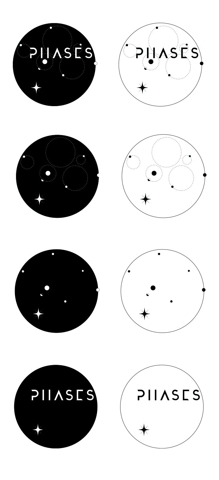
For the logo design I drew inspiration from 17th century celestial maps and astronomy, exploring how these orbital paths could exist in the context of the individual letters/words in the acronym. The result was a handful of logo variations and title aesthetics that could be applied with some flexibility that would allow us to modify the artwork and logo to tease future themes of the shows.
Credits
PHASES Co-creation by Liz Epp and Laurel Carroll
Photography by Ty Boespflug